The significance of UX/UI design in mobile applications is more pronounced now than ever. As mobile technology continues to evolve, so do user expectations and preferences.
Mobile devices have become an inseparable part of daily life for many, providing essential services ranging from communication and entertainment to banking and healthcare. With the exponential growth in the number of available apps and the diversity of user needs, the competition among app developers is fierce.
Mobile apps need more than outstanding features – they must also have an intuitive, seamless, and engaging user experience. User experience is a core requirement in today's saturated market since the way a user interacts with an app can determine its success or failure. An app's interface is often the first point of interaction with the user, and a well-designed interface can create an immediate positive impression.
Below we take a look at some of the key characteristics of good UX/UI design:
The principle of simplicity has remained consistent throughout the years and has proven itself to be timeless in the context of design. Users typically want to achieve their goals efficiently without going through complex processes. Whether booking a ride, making a purchase, or tracking fitness, what users usually seek is a streamlined experience that gets them from points A to B without unnecessary distractions or difficulties.
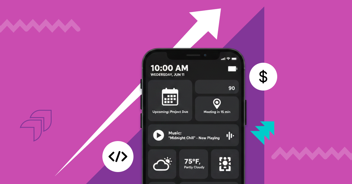
Modern mobile application design trends emphasize a minimalist approach, focusing on core features while avoiding unnecessary elements that could confuse users. This philosophy aligns with the notion that less can indeed be more.
By reducing clutter and only displaying essential components, users can focus on what truly matters within the app. This type of design minimizes cognitive load and enables users to complete tasks more quickly and effortlessly.
Standardization is a cornerstone of user experience and user interface design that greatly influences user satisfaction and engagement. By promoting an intuitive interface where elements function predictably across different parts of the application, users can interact with confidence and efficiency.
Let's delve into various aspects of consistency:
Visual Standardization: This includes maintaining uniformity in fonts, colors, images, and other visual elements across the application. Visual consistency creates a cohesive look and feel that enhances brand recognition and creates a harmonious user experience.
Functional Standardization: Functional consistency ensures that similar elements and actions work the same way throughout the application. If a swipe gesture opens a menu in one section, the same gesture should have the same effect elsewhere.
Content Standardization: Content consistency refers to using uniform language, tone, and terminology across the application. It ensures that users understand instructions and labels, making navigation more intuitive.
Optimized user flows are a critical aspect of user experience (UX) and user interface (UI) design, particularly seen in the best examples of mobile applications. It refers to the streamlined navigation path users follow to complete a specific task within an application.
By anticipating user actions, reducing complexity, and integrating smooth transitions, designers can create an intuitive and satisfying user experience.
The foundation of optimized user flow lies in understanding the user's goals and expectations. This involves identifying the primary tasks that users want to accomplish within the app and the most logical and efficient way to guide them through those tasks. It requires deep insights into user behavior, preferences, and needs, often gathered through user research, personas, and user journey mapping.
Part of this mapping is to ensure that the visual hierarchy is followed - the structure of what the user actually sees when using the application.
Visual hierarchy is a key principle in UX/UI design that organizes content in a way that reflects its importance. This hierarchical structure guides users through the information, leading them to the most vital parts of the content or interface. This includes factors such as:
Size: Larger elements attract more attention and are often used for headings or critical calls to action.
Color: Bold or contrasting colors can draw attention to specific elements or buttons, guiding the user's eye to essential functions.
Placement: Strategic positioning on the page, such as center alignment or 'above the fold,' can emphasize importance.
Contrast: Using contrast in font types, shapes, or colors helps to differentiate elements and highlight importance.
Spacing: Adequate spacing around elements can create emphasis, allowing users to focus on key areas.
Typography: Different font styles, weights, and sizes help in categorizing information, and creating a visual order.
There is also the tangible feedback the app gives the user to take into account. Let’s consider this in more detail below.
Actual mobile app feedback and accessibility stand as pillars in the realm of UX/UI design and should be incorporated into the testing process.
From the app’s side, feedback, which encompasses visual cues, auditory notifications, tactile responses, and textual messages, serves as the system's communication channel after a user action, enhancing the interaction. Immediate and clear feedback builds user confidence, assists in rectifying errors, and guides user behavior.
On the other hand, accessibility emphasizes the inclusivity of digital products. Modern design ensures legible text, appropriate color contrasts, sizable interactive elements, and alternative content, aiming to cater to users across the spectrum of abilities. The incorporation of gesture and voice controls further augments this inclusivity.
But screens come in all different shapes and sizes, so it’s essential to ensure that your UX/UI design is adaptable to all of them without compromising on quality.
Adaptability in UX/UI design has become indispensable in an era characterized by a vast array of device sizes, screen resolutions, and orientations. The diversity in devices, ranging from smartphones to tablets to smartwatches, poses a significant challenge to designers and developers. This challenge includes working with cross-platform development frameworks.
Modern mobile applications are now equipped with responsive designs that effortlessly adjust to different screen dimensions. This ensures that users enjoy a consistent and efficient experience, whether they are on a small phone screen or a larger tablet display.
The layout, images, text, and interactive elements are all reconfigured dynamically to fit the screen's size and orientation.
Then there is the need to pay attention to data security and privacy.
Data security and privacy, although not traditional design principles, play a vital role in the UX/UI design of mobile applications. In an age where personal information is constantly being shared online, transparent and responsible handling of user data is paramount.
UX/UI design can influence user trust through the clear and accessible communication of privacy policies, explicit consent requests, and unambiguous information about data usage.
Users need to understand what data is being collected, how it's being used, and how it's safeguarded. This helps to:
Build Trust: When users feel confident that their information is handled securely and responsibly, they are more likely to engage with an app.
Comply with Regulations: Many jurisdictions require strict adherence to data protection laws, and transparent design practices can aid in legal compliance.
Enhance User Control: By providing options to manage privacy settings, users are empowered to control their personal data.
As technology advances, these principles continue to evolve, shaping the way we interact with mobile devices. By following these principles, designers can create apps that not only meet functional requirements but also provide an enjoyable and seamless user experience.
NineTwoThree Studio specializes in UX/UI design and has a team of experienced designers and developers who are experts in their field. We have a deep understanding of the latest design trends, technologies, and tools, ensuring that your app is not only visually appealing but also user-friendly.
Whether it's adaptability across various devices, specific visual hierarchy needs, or accessibility considerations, we have the ability to cater to unique requirements. Reach out to us with your mobile app requirements today!


.jpg)